Press Release
As anticipation builds for the publication of the new James Bond
novel, Solo by William Boyd, Jonathan Cape is delighted to reveal
the official cover today, Thursday 1 August 2013. They have also
announced that British actor Dominic West will be the narrator
of the audiobook edition of Solo.
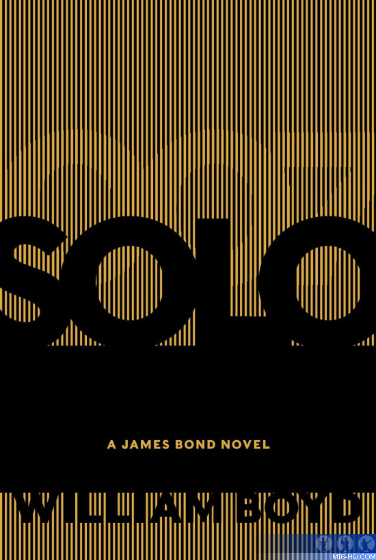
The cover, which has been designed by renowned
Random House Creative Director Suzanne Dean, features a stunning
retro-inspired
die-cut
design including, amongst other things, bullet holes. Dean took
her inspiration from the 1960s setting of the book and design
heroes including Saul Bass, who was also the inspiration for
Random House’s Vintage Classics Ian Fleming series.
In true James Bond style, the primary colours and bullet holes
of the dust jacket hint at danger, adventure and espionage - whilst
removing the outer dust jacket playfully reveals a red hardcover
printed with bullet burns and a gecko, a reference to James Bond’s
African mission in the book.
Suzanne Dean, who has been praised by authors including Julian
Barnes and whose other work includes the covers of Ian McEwan’s
Atonement and Mark Haddon’s The Curious Incident of the
Dog in the Night-Time, commented on her design:
‘A new Bond cover needs to do a lot of things at once. It needs
to appeal to literary and commercial audiences, both fans of
the original 14 Fleming books and film fans. It needs to reflect
both the content of the novel and capture the reader’s
imagination.
‘William Boyd has chosen to set Solo in 1969, and achieving
this period feel was one of my core aims when designing the cover,
whilst also ensuring that the book retained a fresh and contemporary
lay-out. I didn’t
want just to depict a cinematic image, but rather to try and
reflect the essence of Ian Fleming’s
original novels as well William Boyd’s own take on James
Bond.’
A version of this cover will also be featured on the audiobook
edition of Solo, read by Dominic West. West is perhaps best-known
for his roles in the HBO series The Wire, BBC Two series The
Hour and, most recently,
BBC4’s biopic Burton
and Taylor, where he played the title role of Richard Burton
opposite Helena Bonham Carter. Richard Cable, Managing Director,
Vintage
Publishing, comments:‘
We are thrilled to have such a distinguished actor as Dominic
West reading Solo. It’s the
perfect combination of reader and text. Audio listeners are in
for a real treat!’
Suzanne Dean’s full statement on the design of
Solo:
‘A new Bond cover needs to do a lot of things at once. It needs
to appeal to literary and commercial audiences, both fans of
the original 14 Fleming books and film fans. It needs to reflect both the content
of the
novel and capture the reader’s
imagination.
William Boyd has chosen to set Solo in 1969, and
achieving this period feel was one of my core aims when designing
the cover,
whilst also ensuring that the book retained a fresh and contemporary
lay-out. I didn’t
want just to depict a cinematic image, but rather to try and
reflect the essence
of Ian Fleming’s original novels as
well William Boyd’s own take on James Bond.
Inspiration came from my design heroes Paul Rand, Alvin
Lustig and Saul Bass, all of whom were practicing in the sixties
and
whose style evokes a sense of the time. Saul Bass, a graphic
designer and filmmaker, was
perhaps best known for his design of film posters and motionpicture
title sequences, including
Psycho, The Man with the Golden Arm, and North by Northwest.
He once described his main goal for
his title sequences as being to ‘try to reach for a simple,
visual phrase that tells you what the picture is all about and
evokes the
essence of the story’. Alvin
Lustig rejected the typical cover design that summarised a
book through one general image. His
method was to read a text and get the feel of the author's creative
drive, then to restate it in
his own graphic terms.
I used the
title of the book - Solo - as my starting
point. In the book, Bond goes on an unauthorised solo mission,
recklessly motivated by revenge. I had always been keen, since
finding out the title, that there
might be a way to use the two o’s within Solo and link
it to the zeros in 007. I used the font Folio, a sans-serif font
designed by Konrad
Bauer
and Walter Baum in 1957 which became popular
during the sixties. It has a strong circular ‘o’ in
its bold version, which formed an important feature within the
design. In my design,
the shadows thrown by the overlaying letters
suggest hidden danger and tension, whilst the final ‘o’ in
Solo suggests a door, or an escape route. The die cut holes in
the dust jacket
are an abstraction of bullet holes, and
represent a pivotal part of the novel. The holes on the Solo
cover reveal
a flash of the
red binding below; when you remove the dustjacket, the binding
playfully reveals a
gecko - a
reference to Bond’s
African mission in the book - and burn holes from the
bullets, giving drama and an interactive expression to the
whole package.’
 Above: The US hardback (Harper Collins) cover artwork uses a bold black and gold design. Above: The US hardback (Harper Collins) cover artwork uses a bold black and gold design.
|
|