 |
| |
Nobody did it better - a closer look at Bob Peak's
"The Spy Who Loved Me" poster...
|
|
Nobody Did It Better - TSWLM Poster
18th June 2004
For various reasons "The
Spy Who Loved Me" was a landmark film in the history
of the James Bond franchise. Arguably regarded as Roger
Moore's finest performance in the role of James Bond, the
10th production is one of the highlights from the twenty films
to have been produced by EON since 1962. However, before its original
release back in 1977, industry speculation regarded "The
Spy Who Loved Me" as a potential gamble, especially for Albert
R. Broccoli who was now for the first time the sole producer of
the Bond movies.
|
After the relative disappointment of "The
Man With the Golden Gun" (1974) both critically
and (by Bond standards) financially it was commonly felt
that the 'spy genre' had finally run its box-office
course and that the worldwide audience were becoming jaded
by the adventures of Bond. Having released nine films over
twelve years, the classic Bond formula needed revitalisation
and for the first time in their history a gap of nearly
three years would occur before the latest Bond adventure
would be unveiled in cinemas.
Back With A Bang
Using a then staggering budget of nearly $14 million, United
Artists and Albert R. Broccoli were determined to bring
James Bond back in style. With the last two films compelled
to imitate popular themes and styles inspired by other movies
(i.e. Shaft & Enter the Dragon), it was time to once
again set the cinematic standard by which others would follow
and Broccoli in particular ensured that every dollar would
be seen on the big-screen.
Director Lewis Gilbert and Production Designer Ken Adam
both returned after several years giving the movie a confidence
and visual assurance not seen in several years. Composer
Marvin Hamlisch replaced John Barry and offered a contemporary
soundtrack that reflected the mood of the time. Overall
the film contained all the elements that they'd had at their
peak during the mid sixties but also successfully added
moments that would typify Roger Moore's tenure in the role
and finally established him as James Bond.
|
|

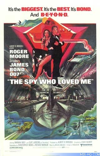
Above: Original 1977 US One Sheet
from The Spy Who Loved Me
 Buy
- Cine Art Gallery: £120.00
|
Sell It To Me Mr Bond..
Outside of the actual production, the most important aspect of
the making of "The Spy Who Loved Me" was the marketing
and advertising. After such a long gap between releases it was
important to remind the world that James Bond would return bigger
and better than before, the advertising strap line was even bold
enough to say just that, but to indicate the new direction the
film was taking a subtle change was made regarding the image.
The spearhead of any campaign is the main film poster that aims
to tease and capture the imagination of its potential audience,
and those that were created for the previous Bond movies are some
of the finest ever produced. After the initial formula was established
regarding the content of the films, the posters reflected the
audience expectation in that they contained a healthy dose of
action, gadgets and girls. The two main artists responsible for
several of these were Robert McGinnis and Frank McCarthy whose
particular styles perfectly captured the early period of Bond,
but this was a period of change and a new artist was introduced.
One of the finest and most prolific artists of his generation,
Bob Peak (1927 - 1992) developed a style that made strong use
of light and shadow, highlighted by flashes of vibrant colour
that helped concentrate the attention of the viewer to particular
details. When he came to designing film posters his style was
particularly unique and he became highly sought after during the
mid seventies and early eighties working on key images for "Rollerbal"l,
"Apocalypse Now" and "Superman the Movie".
He approached "The Spy Who Loved Me" with his usual
technique and sensibly included all the elements that were expected
by eager Bond fans, what was important, was that they were now
portrayed in a style that indicated a fresh approach like the
film it was trying to sell. It now stands as one of the most unique
poster images from all of the past movies and was so successful
at the time that it was used almost all around the world with
little or no change for the foreign markets.

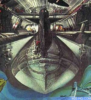
Above: Close up showing the hidden face
 Buy
- Cine Art Gallery: £120.00
 |
|
Something Original
One of the curiosities of the Bond advertising campaigns
is the infrequent use of one of the major selling points
of each movie - and that is the various villains that Bond
must face. Until the last several years, few of them have
featured in the artworks alongside Bond; notable in their
absence have been Auric
Goldfinger, Mr Big
and Emilio Largo.
Added to that list you might like to add Karl
Stromberg… but then again, perhaps we should take
a closer look.
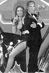
On first viewing "The Spy Who Loved Me" design
contains many of the major elements of the film, James Bond
stands back to back with agent Triple-X,
the Sphinx stands proudly at the top of the composition
alongside the requisite camels. Bond rides along on a wetbike
as the Lotus
Espirit glides gracefully through the ocean, while at
the base of the poster enemy soldiers carry out their deadly
work within sight of Atlantis.
|
Hidden Face
Dominating the central section is the interior of the Liparus
that contains the captured nuclear submarines and staring from
out of the shadows is Stromberg. Although not initially apparent,
the inclusion of Stromberg is a very subtle, almost subconsciously
placed image. By no means an accurate rendering of the actor Curt
Jurgens, what we do have is a menacing portrait that will give
the viewer a feeling of being watched from within the poster that
once found will always be seen. To grasp the full impact of this
image, look at the area of artwork beneath the feet of Bond &
Anya. The central submarine is the focal point and forms the basis
of the face; the conning tower represents Stromberg's nose and
brow. Either side of the tower the two rectangles of light at
the rear of the Liparus are his eyes, the bow of the submarine
forms the chin and the shafts of white light above this is his
hair.
While some might say that this is just a fluke of perspective
and colour, I would also like to draw your attention to a small
detail on the pattern of Anya's dress just by her thigh. If you
look closely at the black shapes against the white area, it is
possible to make out the most iconic of James Bond poses - the
now standard shot of crossed arms and gun across the chest. Overall
the effect is a perfect representation of what draws us all towards
each new Bond movie - action, beauty, escapism… and a little
touch of class.
Many thanks to Paul B. Harris - Cine Art Gallery (London).
Images courtesy Cine Art Gallery
Related Articles
 MI6 "The Spy Who Loved Me"
Coverage
 MI6
"The Spy Who Loved Me" Poster Coverage
 Cine
Art Gallery Official Site